Assessing Design in Students' Digital Projects
“But this isn’t an English class,” my students protest, when they discover that I have given their poorly written paper a grade less than A. “I thought you were grading this on the ideas!” “Yes,” I agree. “And your ideas are scattered, nebulous, and contradictory. The clunky and incoherent sentences are only a symptom of the real problem.”
No, I don’t really say it quite that bluntly, but I do launch into my speech about how the process of crafting and revising your writing is part of the process of defining and developing your ideas, etc., etc. Good writing is good thinking.
So we take it for granted that we need to include various aspects of writing among our assessment criteria when we assign papers. But as we venture into assigning more new media projects, we may hesitate to evaluate the design component of those projects in courses not specifically focused on design. There are two reasons, I think, for this hesitation: 1) we fear that we are judging mere appearances rather than substance, and 2) we doubt our own competence to make informed judgments, beyond our subjective preferences.
If we are going to assign our students to work in new media, however, we need to give them feedback on their designs, for the same reasons that we need to give them feedback on their writing: because the purpose of any such assignment is (or ought to be) to require students not only to interact with course content, but to formulate coherent ideas about it, and to communicate those to others.
In order to evaluate design in a way that is not only clear and consistent, but also substantive and useful to the students, we need to be able to articulate criteria for good design. Fortunately, this is not as hard as you might think! Using the materials on this page, you can create a design rubric that will help your students use design effectively, and allow you to grade it fairly.
The fundamental questions that you need to ask, and that you need to get students in the habit of asking, are, What are the most important ideas you want to convey with your project? and, To whom do you want to convey them (who is your audience)?
Sound familiar? Right. It’s the same way you’ve been teaching and grading writing for years. So all you need to do is translate your criteria into visual terms. For example:
Tone. In a written assignment, you might evaluate this based on vocabulary, length and complexity of sentences, and use of first person. In design, you are looking at color scheme, typography, and graphics, but you are still asking the same basic question: does the work show awareness of its audience and a contextually appropriate attitude toward the material?
Organization. You know how to assess whether a writer’s sentences and paragraphs flow logically from one to the next while working to construct an argument. Ask yourself the same kinds of questions about the layout of a new media project: are the parts that relate to each other actually near each other?
You can undoubtedly sense all this intuitively when looking at a visual project, but pinning it down to specific components will be much more useful than telling a student it just doesn’t “feel” right.
“No,” you explain patiently, “this isn’t a design class.” And you communicate to your students, through classroom activities, grading rubrics, and feedback on their papers, that design is crucial to how they express ideas in visual media. It’s not just the frosting.
Friday, June 8, 2012
Design and Digital Pedagogy, Part II: Design and Participation in Class Blogs
A simple google search turns up numerous sites offering advice on the pedagogical uses of blogging, sample assignments, assessment strategies, etc. (Not to mention the heated debates over Blogs vs. Term Papers - but let’s not go there.) Much harder to find, however, are discussions of the design of class blogs, and how design considerations may affect student participation, and even the quality of student work.
It seems obvious enough that an attractively designed page will be more inviting to students, will encourage them to spend more time there and to put more effort into their posts. But there’s more to it than luring them in with eye candy. The visual look of your page can communicate to students whether you are inviting them to a “hang,” where they can show up in their mental pajamas, relax on digital beanbag chairs, and chat over popcorn and root beer, or to a dinner party, where they will need to tuck in their shirts and use the correct fork. If you opt for the more formal tone, how will you balance academic standards with giving students a sense of ownership of this digital space? The more students can identify positively with the class blog, the harder they will work to make their posts meet the standards that the visual presentation subconsciously conveys. If your blog is open to the public, what kinds of readers would you like to attract? Professionals in the field who will respond substantively to the posts? Your students’ peers? Younger students, so that your class can act as the “experts”? Your design will convey to users who is invited in, and how they are expected to behave.
All that still seems pretty obvious, and more or less superficial. But consider a particular pedagogical problem. A colleague of mine recently attempted to use a blog as the medium for discussion of a particular book among his students in a particular course. The results, he said, were so disastrous that he will never attempt it again. Now, this colleague is no technophobe, has no fears that the blog spells the end of liberal education as we know it. So what was the problem? One student, he said, had posted so frequently and so diligently, with long diatribes that attacked the book under discussion and the opinions of other students so vigorously, that the other students felt he had completely hijacked the space, and either stopped putting effort into their own posts, or stopped posting altogether.
There are low-tech approaches to this problem, of course: just as he would have done with a student who was dominating discussion in the classroom, my colleague spoke to the student in person, urging him to tone down his rhetoric, etc., all to no avail. But could design have prevented this from seeming like such a problem in the first place? What if the class page was set up so that, from the home page, the user saw only the first few lines of each post? That would have the effect of equalizing all of the voices in the conversation, at least in the initial view. Neither the students nor other readers would have to scroll down past one classmate’s endless rant in order to get to the thoughtful comments of others farther down.
Furthermore, this format would encourage students to craft their first sentences more carefully, in order to spark a reader’s interest, and to convey the main idea. The structure itself builds in an intrinsic reason for what otherwise seems to students like just one more pointless requirement: “Wait - we have to have a main idea?”
So, should you rush right to your class blog and adorn it with cutesy pictures, flashy fonts, and eye-catching colors? Maybe. But first, you will need to think carefully about what you want your blog to accomplish. Then you will want to study the other posts on this page for design principles that will help you achieve your goals.
The Challenges of Video Production
Thanks to programs like iMovie, there is no longer a technical hindrance in creating dynamic videos. Instead, the challenge lies in creating an interesting story and telling the story through appropriate audio and visuals. To demonstrate these goals in story telling, I created a short video about living on or around UVic's campus for DHSI. By explaining my thought process in creating this video, I wanted to illustrate the questions that occur in trying to create cohesion between form and content in video.
Elements of the video that enhance the story are the short, quick shots, the fast-paced music, and variety of footage. You see a lot of people and they each have a captivating personality. For example, the footage of Ali McGhee was shot while we were sitting in a dark, fairly bland computer lab but her manner of speaking and what she has to say is intriguing. Check out how she looks directly in the camera, not at me. That gives the impression that she's having a conversation with the viewer and makes the video more personal.
Still, it is not a good idea to only include headshots. Headshots will get boring, so I added additional visuals that were associated with the commentary, like screencasts of GoogleMap or photos. Because one of my goals was to be informative, I wanted to be clear about where to go and what to use. I wanted everyone who sees this video to know that the 26 bus is in Bay 7, instead of surveying the bus station until you saw the Bay 7 sign. Similarly, I show the BC Transit website and the process of finding the schedule. By the way, fare is $2.50.
Because living at UVic isn't necessarily a chronological story, I decided to organize the video by the order in which a future DHSI participant would figure out the logistics of living here. I wanted to let the audience know what to expect by listing the questions at the beginning. Then, they would also know when to expect the video to end and that the last clip of Ali's experience with couch surfing is an aside. If I had included the footage of Ali within the main section of the video, it would have made the viewing experience inconsistent. She is offering a personal story while the others are giving tips and tricks. At the same time, what she had to say is important in case a participant does get stranded so I moved it to the end.
Keeping the outcome in mind throughout shooting footage and editing goes a long way!
Photography 101, On the Editing Floor: Post-Production
So you went out, bought your camera, took your photos
(paying heed to lighting and composition!). Now you’re ready to edit them. This
has become increasingly easy to do if you’re working with digital photography. There
are many high-quality photo editors available.
Adobe Lightroom 4 is software used by many professional photographers, it works on a Mac or PC computer and allows you to run batch edits across a large collection of photographs at one time. Lightroom allows you to tweak and improve your photographs but retains the original file for archival purposes. Adobe Photoshop is also a popular choice for editing your photos (there are many versions available from consumer to pro level). Picassa is free software that allows you to do some quick, easy edits (add colour filters, adjust saturation, the “I am feeling lucky” edit option will quickly fix any glaring problems with your photos). iPhoto for Mac users is easy to use and allows you to quickly share photos with friends, save photos in web-friendly file sizes, and upload your photos to social media websites.
 |
| Gimp 2.2 by Luana on Flickr. All Rights Reserved |
Adobe Lightroom 4 is software used by many professional photographers, it works on a Mac or PC computer and allows you to run batch edits across a large collection of photographs at one time. Lightroom allows you to tweak and improve your photographs but retains the original file for archival purposes. Adobe Photoshop is also a popular choice for editing your photos (there are many versions available from consumer to pro level). Picassa is free software that allows you to do some quick, easy edits (add colour filters, adjust saturation, the “I am feeling lucky” edit option will quickly fix any glaring problems with your photos). iPhoto for Mac users is easy to use and allows you to quickly share photos with friends, save photos in web-friendly file sizes, and upload your photos to social media websites.
Visit PC Magazine for more information about photo editing software (includes reviews)
Photography 101: Photographing People
Photographing people, especially if you don’t know them well, can be one of the hardest things to do. Some people may not want to have their picture taken. In some cultures, taking someone’s picture is considered to be very bad luck. Your subject might just be very camera-shy. Taking photos of people requires flexibility, patience, and respect. Don’t take pictures of someone who really doesn’t want his or her picture taken. It probably wouldn’t come out well anyway.
You will also likely have to overcome some of your own trepidation when you begin photographing people, but, if done well, these images will be some of the most interesting and rewarding pictures you can take.

So how do you make sure you get the best photo possible?
1. Get Close. It may make you nervous to get in someone else’s space, and you should probably ask permission before you do so, but you’ll be able to get a much more intimate, interesting photo this way.
2. Don’t Force It. Say cheese! Staged photographs can look cheesy, canned, or just plain boring. Sure, there’s a time and a place for people giving their best megawatt smiles all in a row, but the best photos of people tend to be the ones where they’re being natural (well, as natural as possible with a camera sticking in their face). People often start out quite stiff and nervous when you’re taking pictures of them “in the wild,” as I like to call it. My solution to this is to persist and stick around. After you take a gajillion photos, they will have stopped worrying as much about how they look and what you’re doing.
3. Take Some Time. If you have the luxury of hanging out with a person or group of people for a while, you’ll have more opportunity to get shots while they go throughout their days. This will provide you with some variety, and will give you a chance to take spontaneous, unstaged photos. Keep your camera on you at all times and be ready for any opportunity! Here’s a good tutorial if you want more info.

Photography 101: Shot Composition
Ok, so now you’ve thought about lighting. What’s next? Well, you have to figure out where you want your subject in the picture. We’ve all seen photos where the person is in the dead center of the shot, surrounded by giant swathes of unused, meaningless space. So, first thing’s first –
Think about EVERYTHING in your picture
Really spend some time thinking about where you want to take your shots. Is there something interesting or unique about the place you’ve chosen to shoot? Is there a reason to include lots of background behind, or around, your subject? Is there an interesting pattern in the picture (repetition in shapes, figures, etc)? Is some random guy’s foot sticking into the bottom right corner of your frame?
Avoid the Center
Our instinct when we take a photograph is to shoot the subject right in the middle. If the subject is the most important thing, why shouldn’t it be in the middle? That’s how we know what to look at, right?

Wrong. Luckily, we have developed the capacity to infer the importance of objects in ways other than calculating how close to the center of a picture they appear. It looks pretty uninteresting and uninspired, doesn’t it? Instead of doing this, experiment with angles and perspective. Remember the “Rule of Thirds”: Every picture can be divided into nine segments in three sections. Your subject should never be right in the middle section. Instead, try moving it (or at least part of it) into the left or right sections.

Experiment!
Now that most casual photographers have moved into digital and away from film, you have lots of chances to take that perfect photograph, so don’t be afraid to experiment. Sometimes breaking all the rules can result in something you never expected. [insert final photo…of something] For more information and tutorials, go here and here.
Think about EVERYTHING in your picture
Really spend some time thinking about where you want to take your shots. Is there something interesting or unique about the place you’ve chosen to shoot? Is there a reason to include lots of background behind, or around, your subject? Is there an interesting pattern in the picture (repetition in shapes, figures, etc)? Is some random guy’s foot sticking into the bottom right corner of your frame?
 |
| There are a lot of elements in this shot, but they come together in a unified way. |
Avoid the Center
Our instinct when we take a photograph is to shoot the subject right in the middle. If the subject is the most important thing, why shouldn’t it be in the middle? That’s how we know what to look at, right?

Wrong. Luckily, we have developed the capacity to infer the importance of objects in ways other than calculating how close to the center of a picture they appear. It looks pretty uninteresting and uninspired, doesn’t it? Instead of doing this, experiment with angles and perspective. Remember the “Rule of Thirds”: Every picture can be divided into nine segments in three sections. Your subject should never be right in the middle section. Instead, try moving it (or at least part of it) into the left or right sections.

Experiment!
Now that most casual photographers have moved into digital and away from film, you have lots of chances to take that perfect photograph, so don’t be afraid to experiment. Sometimes breaking all the rules can result in something you never expected. [insert final photo…of something] For more information and tutorials, go here and here.
 |
| This shot is interesting because of the unconventional angle. |
Photography 101: Light
Now that you’ve decided on the camera you want, you’ll need to figure out what photos to take – and how to take them. To do this, you need some basic information on key photography concepts, like lighting and shot composition, and you’ll also need to know some tips and tricks for photographing different kinds of subjects. This series of blog posts will address these topics. We’ll begin today’s lesson with lighting. The first thing you have to decide is what kind of light you want.
Hard Light
“Hard” light comes from direct sunlight and very bright sources of light. It can also be produced by shining a small, direct source of light on your subject. Hard light can be useful for edgier, grittier photography. Knowing this, it makes sense that hard light will also bring out (and even exaggerate) any less-than-perfect qualities in your subject, so it tends to be less popular for traditional portraits.
Soft Light
Also called “diffuse light,” soft light is indirect and can come from a larger light source (not like the direct sun, more like a light that is bounced off a wall to fill a room). Soft light does exactly that – it softens your subject. It’s often a very popular light for portrait and glamour photography. Think of movie stars in the 1930s and 40s who always looked like they were being shot through gauze (which they often were!). That’s the kind of effect you’re going for here.
Hard Light
“Hard” light comes from direct sunlight and very bright sources of light. It can also be produced by shining a small, direct source of light on your subject. Hard light can be useful for edgier, grittier photography. Knowing this, it makes sense that hard light will also bring out (and even exaggerate) any less-than-perfect qualities in your subject, so it tends to be less popular for traditional portraits.
 |
| Hard light works well here. |
Soft Light
Also called “diffuse light,” soft light is indirect and can come from a larger light source (not like the direct sun, more like a light that is bounced off a wall to fill a room). Soft light does exactly that – it softens your subject. It’s often a very popular light for portrait and glamour photography. Think of movie stars in the 1930s and 40s who always looked like they were being shot through gauze (which they often were!). That’s the kind of effect you’re going for here.
 |
| Flickr user Lizbokt |
Design and Digital Pedagogy, Part I: It's not just the frosting.
When Aimée Morrison stood up on the first morning of DHSI 2012 to describe what she would be teaching in her multimedia design course, she got all 400+ participants salivating (a dozen of us with anticipation, the rest with envy), by announcing that we would spend our week applying the frosting to the DH cupcake. She also unleashed a metaphor that would be pretty much beaten to death over the next 30 minutes, and which, appealing as it is, radically understates the importance of design to any digital project. This is the first of three posts in which I make the case that design is not just decoration; it is as fundamental to digital humanities and digital pedagogy as writing is to traditional scholarship. Along with writing, design constitutes the medium through which our readers/users will engage with our projects. This point is especially crucial in digital pedagogy, where we need to consider students both as users of our materials and as designers of their own.
So let’s try a more nutritious metaphor. Yesterday for lunch, I bought a beautifully packaged Greek salad from the university library’s cafe. Through the clear plastic lid, I could see bite-sized chunks of cucumber and red and yellow peppers, enticingly sprinkled with bits of feta cheese and accented with glossy kalamata olives. As soon as I reached in for my first bite, however, I discovered that those tasty and colorful tidbits rested on top of one giant leaf of Romaine lettuce that had been wedged, uncut, into the bottom of the container.
This salad had major design flaws. It looked pretty, yes, but it failed to take into account the device I would be using (a flimsy plastic fork incapable of cutting vegetables), or my social media platform (a table, at which I sat face to face with people I had just met, and in front of whom I wanted to appear moderately dignified or at least competent - not distorting my mouth to wrap it around an oversized leaf, with salad dressing dripping down my chin). All this made it unnecessarily difficult to get to what should have been the salad’s main substance.
And yet I have to confess that I’ve been guilty of arranging course websites very much like that salad - and then feeling surprised and frustrated to find that my students had picked the fun stuff off the top and left behind the main material that I really wanted them to engage with.
This is not to say that students should never have to grapple with whole lettuce leaves on their own. But we do need to demonstrate the use of knives and cutting boards (or at least train them in delicate nibbling techniques) AND provide a space in which it is safe and expected for them to make a mess.
OK, enough with the salad. The point is, when we are designing digital resources for our teaching, we can’t just stuff all the materials onto the course website and assume that the students will learn from them. We need to design with their learning in mind. Whether we like it or not, our designs communicate values and expectations, and we can and should use design intentionally to promote the kind of engagement with course material that we want. This may be as simple as using layout to indicate which materials are most important; visually coding objects according to the kinds of tasks students are expected to do with them; etc.
When I come out of design class and meet the exhausted looks of my colleague who has been doing battle with GIS all day, I do have the slightly guilty feeling that I have been playing with pink sugar and sprinkles while he dutifully eats his vegetables. But I also know that I’m learning more than how to make unappetizing content into digital Little Debbies for my students. The principles illustrated on this page have helped me see digital delivery of course materials not just as an alternative to photocopying, but as a medium in which I can reinforce what I am telling my students about what kind of work I expect them to do.
Photography 101: Highlights, Shadows, and Artificial Light
These are other major considerations when you’re thinking about lighting. You’ll need to play around with where you are in space to ensure that the direction of your light is illuminating your photograph in the way you want. For example, if you’re shooting someone in direct sunlight on a bright day, you may not even be able to see his or her face because of the shadows that will fall on it. Try varying your shooting locations and angles to get the best pictures you can. Play around with it! Experimentation in photography is a key to success.
Another thing to take into consideration is artificial light. Of course there are many sources of artificial light, but for the purposes of this beginners’ tutorial I’m only going to talk about the one you’ll most likely encounter – the flash. Using your camera’s flash can be great in low-light situations, but often the flash will wash out and flatten your subject. Think about when professional photographers use flash bulbs. You’ll usually see them use bulbs in conjunction with other gear – like umbrellas, light diffusers, etc. The flash, on its own, can be a harsh mistress. See what happens when you don’t use it. Sometimes this will mean you have to hold the camera quite still, but you may like the outcome!
 | ||||
| Many things are wrong in this photo. |
 |
| This one is much better! Can you see why? |
Another thing to take into consideration is artificial light. Of course there are many sources of artificial light, but for the purposes of this beginners’ tutorial I’m only going to talk about the one you’ll most likely encounter – the flash. Using your camera’s flash can be great in low-light situations, but often the flash will wash out and flatten your subject. Think about when professional photographers use flash bulbs. You’ll usually see them use bulbs in conjunction with other gear – like umbrellas, light diffusers, etc. The flash, on its own, can be a harsh mistress. See what happens when you don’t use it. Sometimes this will mean you have to hold the camera quite still, but you may like the outcome!
Color on the Web
Color on the Web
In the past, designers used to recommend "web safe colors," a list of 216 colors that would display exactly the same way, no matter what device they appeared on. This is no longer necessary as most devices can easily generate millions of colors. In HTML and CSS, color is expressed in a six digit "hex code." For instance, the hex code for white is FFFFFF. Here is a handy chart from W3 schools about hex colors. Hex codes correspond to RGB values, a three digit code specifying the amount of red, green, and blue light in a pixel. Most graphics editors and color scheme tools will display the hex code for a color along with the RGB values, which can be useful in editing the CSS of a page- you can make sure you are using the same hue and shade of brown for all of your headings and links, if you should so desire.In working with images, photographic media is best displayed in bitmap color (24-bit) in the JPEG file format. Graphics such as logos and clip art are often best displayed in the GIF format, meaning they will be limited to 256 colors. In thinking about what format best suits your images, consider how much color gradation and variation there are in graphical elements. Also, consider that if you are attempting to match graphical color (in a logo for example) to a page's background color, the two may not always match up. You might end up with a box around your logo, like this:

In this case, you will want to add transparency to the logo so that the page background color shows through, or use an unambiguous background color such as black or white. Matching shades of gray can be particularly difficult.
There exists a plethora of tools online to assist the would-be designer in working with color. Design Shack has a great review of tools available. We worked with Color Scheme Designer to help us choose which colors might work well for our blog. When selecting web colors, keep in mind that you are trying to create a scheme that helps the reader find the most important elements of your page quickly and allows them to read text clearly. Make sure your hyperlinks are distinguishable and keep large blocks of text simple- black and white may be boring, but when your readers are trying to concentrate on getting through a lengthy article, they're not going to want to be distracted by oddly colored text anyway.
Using Color Scheme Designer
What We Did- Color Scheme Designer
We wanted our site to look professional and subtle, but with a hint of youthful forwardness and fun. For a professional look, lots of white space is always a good way to go. We decided that the primary color scheme for our site should be lots of white with gray scale and highlighted with a few bright colors for contrast and energy. Emily noted that magenta was a good color to achieve this goal, so we headed over to the Color Scheme Designer to find another shade that would work well with magenta. We only wanted two "highlight" colors at most, so we selected the designer's complementary color scheme option:

Umm…. Okay. No. So, sometimes, complementary colors only look good together in theory. That blinding alien green color just won't do. This is why the human element is important in design! Let's try another combination, and analogic color scheme:

That's a lot less glaring. We can use magenta with a rich purple or orange tone to draw the eye to the important parts of our blog's layout. The colors are close enough together that they don't clash, but far enough apart that they're interesting to look at. It's still a bit bright for what we're going for though.
In the end, we decided on a color scheme completely independently of the designer's algorithms: purple highlights for our logo and turquoise for our links. Emilie and Verena toned down the saturation of the colors to go with the more understated grayscale tones, making our site more consistent. The design process involves a lot of tinkering, and fortunately it's fairly easy to tinker with colors up to the final stages of the design process.
Remember: As with most principals of design, LESS IS MORE. Have fun playing with colors, but don't go overboard! Keep in mind our examples of professionally done websites above; The idea is to frame and highlight the content of your blog, and too many colors can be very distracting.
Exporting Your Work In Color Scheme Designer
In the far right hand corner, CSD's export tab gives you a number of options for exporting your color scheme. If you are manually entering the hex codes for your colors in a program such as Dreamweaver or Blogger, you can get the exact shades you want by exporting them using the HTML/CSS option. This will give you a grid of the hex codes representing the colors in your scheme, under various shades and saturations:
The XML option will export your palette colors as an XML document. If you wanted to, you could use this option to create a database of different palettes and use XSLT to display them. This function won't help you add color to your webpage, however.
The text option merely generates a list of hex codes and RGB values for all of your colors. The ACO and GIMP options are for importing your palette into a graphics editor such as Photoshop or the GIMP.
Photography 101, Part V: Mirrorless Interchangeable Lens Cameras
If you want to take excellent images on par with a DSLR but want a lighter, more compact camera, you should consider buying a mirrorless camera (or sometimes called a compact system camera). These cameras have the same sized sensor as a DSLR (allowing for high image quality) and you can take pictures in manual mode or simply “point and shoot.” The removal of the mirror and optical viewfinder reduces the bulk of the camera body. Although it will be a bit of a stretch to fit this camera into a pocket, it is lightweight and can be easily stashed in a small camera bag or purse – no need to carry this camera around your neck!
DPReview compiled a comparison of leading cameras in this field
 |
next-gen interchangeable lens camera. LoneWalkerNYC on Flickr. All Rights Reserved |
DPReview compiled a comparison of leading cameras in this field
Podcasting: The Benefits of Audio Design
DHSI Design Podcast: Why Podcast?
Despite the growing reliance on visual mediums of new media, podcasting presents an accessible method of sharing information. Digital audio content hosted online through podcasts are easy to upload, distribute and download, meaning that anyone with a computer, microphone and editing software can make podcasts.
 |
| Working in Garageband |
 |
| Podcast Master Track |
 |
| Final Mixdown of Podcast Track |
Photography 101, Part VI: The Best Camera Phones
Many people are interested in documenting their lives via social media like Facebook and Twitter. Technology now allows us to take photos, upload them, and tag ourselves – and our location – all on the same device. Camera phones are now ubiquitous, so how does yours compare?
Predictably, the slick Apple iPhone 4’s camera wins out in this category. Apps like Instagram and Hipstamatic make it even easier to edit and add effects to your snapshots after the fact. But for those of us not in the cult of Apple, there are other options. The HTC Evo3D, an Android phone, is another great choice, as are the Motorola XT720 and the Samsung Galaxy. Tech Radar has a great list – they’ve taken the same pictures with 10 different camera phones and reviewed them accordingly.
Of course the sky is (almost) the limit when it comes to a camera, but hopefully this guide has gotten you to think about what might work best in terms of your own needs and values. I encourage you to do plenty of research before buying your camera – the websites I’ve linked to above are great places to get expert advice and ensure that you make the best purchase possible. Happy shooting!
 |
| The iPhone 4 is top rated for photography. Nick Morris, all rights reserved. |
Predictably, the slick Apple iPhone 4’s camera wins out in this category. Apps like Instagram and Hipstamatic make it even easier to edit and add effects to your snapshots after the fact. But for those of us not in the cult of Apple, there are other options. The HTC Evo3D, an Android phone, is another great choice, as are the Motorola XT720 and the Samsung Galaxy. Tech Radar has a great list – they’ve taken the same pictures with 10 different camera phones and reviewed them accordingly.
Of course the sky is (almost) the limit when it comes to a camera, but hopefully this guide has gotten you to think about what might work best in terms of your own needs and values. I encourage you to do plenty of research before buying your camera – the websites I’ve linked to above are great places to get expert advice and ensure that you make the best purchase possible. Happy shooting!
Photography 101, Part IV: The Best Entry-Level DSLR Cameras
For the true photography aficionados, the DSLR (Digital Single-Lens Reflex Camera) will be the best choice. These cameras can get very expensive indeed, so I’m just looking at the basics here (which could still cost you between $500 to $1000). Canon and Nikon tend to collect the most accolades in this category.
The Canon EOS Rebel is a very popular choice, and is consistently rated at the top of “Best of” lists. The Nikon D3100, 5000, or 5100 come next, followed by the Sony Alpha (model SLT A37 or 57). These cameras will produce excellent image and video, and you will be able to tweak a lot of settings on them – they’re very much made for customization, if that’s your goal. Many of these cameras come with good “starter lenses,” which you may eventually want to upgrade if photography becomes a true passion for you. See recommendations and ratings here and here.
The Canon EOS Rebel is a very popular choice, and is consistently rated at the top of “Best of” lists. The Nikon D3100, 5000, or 5100 come next, followed by the Sony Alpha (model SLT A37 or 57). These cameras will produce excellent image and video, and you will be able to tweak a lot of settings on them – they’re very much made for customization, if that’s your goal. Many of these cameras come with good “starter lenses,” which you may eventually want to upgrade if photography becomes a true passion for you. See recommendations and ratings here and here.
 |
| A DSLR with wide-angle lens will produce great photos. Joseph Lamperez, all rights reserved. |
Photography 101, Part III: The Best Budget Cameras
 |
| The trusty, budget-friendly Lumix DMC-FH25 |
“Budget” can be a hard word to define when you’re discussing electronic gear, but here I’m discussing cameras that are under $200 (sometimes well under). I’m somewhere between this category and the above in terms of my own values as a photographer, so I chose to purchase a Panasonic Lumix (model DMC-FH25). It’s not the fanciest of the Lumixes, but it’s a solid camera that didn’t break the bank, and it’s consistently top-rated. Unlike some of the more expensive compacts, the budget cameras may not have great zoom capabilites, may have a slightly lower resolution, etc. But these are great for photographers who want the ease of taking pictures without having to fiddle with a ton of settings – much of the time the “Automatic” setting will be optimal.
 |
| A good budget camera will still capture plenty of detail. |
See CNet’s list of the best budget cameras here.
Photography 101, Part II: The Best Cameras for Travel
 |
| Negril, Jamaica, 2011. Ali McGhee, all rights reserved. |
 | |
| Always be ready with your camera in case you go somewhere photo-worthy! |
Top-rated cameras for this purpose are the Panasonic Lumix DMC-TZ30, the Nikon Coolpix S9300, the Canon PowerShot SX260, and the Sony Cyber-shot DSC-HX20V. See a full list of top-rated travel cameras with reviews here and here.
Photography 101, Part I: The Camera
Interested in photography? You’ve come to the right place! The good news is that taking pictures has only gotten easier to do. Since the word was first coined in 1839, the technology of picture-taking has become both more sophisticated and more accessible. As photography has become increasingly popular, and as the number of devices that can take photos have grown exponentially, options can feel overwhelming. This post will guide you through some of the choices you’ll be faced with as you start taking pictures.
Decide What You Value
This is not yet about deciding what you feel is picture-worthy. It’s a little more fundamental, and you should think about it before you even pick out your camera. Ask yourself: what do you value most in terms of your own photo-taking practice – affordability, portability, quality? Do you want to take pictures of your vacations or document your family? Use photos to check in on Facebook or become a professional portrait photographer? Your answer can change later (or you can have multiple answers!), but when you’re just starting out, think about your most basic needs and work to meet those first. It’s easy to be excited by all the bells and whistles of fancy cameras, but be realistic about what will serve you best. Throughout this series of posts, I'll be compiling a list of cameras suitable for a few different purposes. There is some overlap, as well (for instance, many budget cameras--the second area I'll be reviewing--are also good compact/travel cameras).
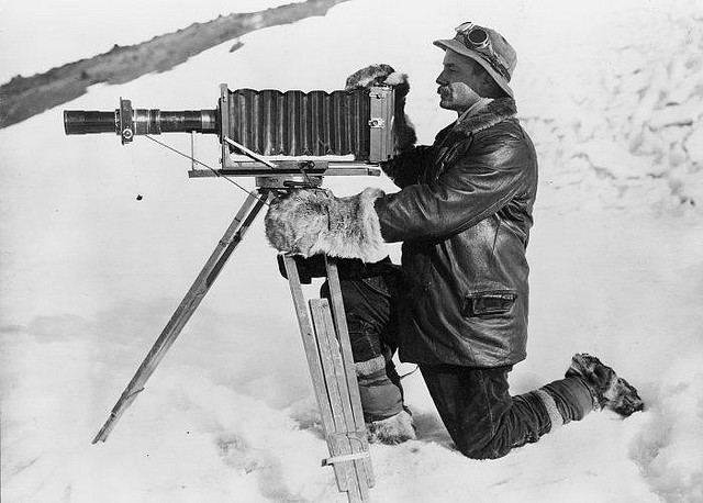 |
| Herbert George Ponting and Telephoto Apparatus, Antarctica, January 1912 |
Thursday, June 7, 2012
Video formats
A worthy mantra for web design is “consider the user” so let’s look at one way this affects your video file format choice.
Although laptop and desktop computer processors are operating at speeds fast enough to handle larger and larger video files, many users will be viewing your videos on small, mobile devices.
A helpful feature of the iMovie export function is a chart that indicates which file formats and sizes are the best choices for various types of hardware:
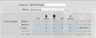
While you may be tempted to maximize the beauty of your video in HD glory, a smaller format could make your work more accessible to a wider range of potential viewers.
Principles of Design: Composition
The end result of a visually decipherable website is often at odds with the piecemeal process of its composition. Designers put in incremental creative effort - using aspects such as colour, typography and layout - that, once integrated, must cross the gap instantiated by the graphic user interface: the gap of the producer and the consumer/viewer/reader. Furthermore, visual composition tends to hit us all at once: the overall effect of the individual design components working together is important.

The difficulty of describing visual stimuli and their impact naturally carries over in the narration of one's design choices. One thing we definitely learned in the collaborative space of DHSI is that to work on creating a website requires having a vocabulary to communicate what desired effect you want to achieve, and through what constitutive parts and processes.
So bear with me!
From the earliest stages of brainstorming, our group found itself employing the vocabulary of visual communication almost unconsciously as we talked through the principles we wanted the visual composition of DHSI Design to achieve. One of the first words used in conversation was "subtle", then followed by the idea that we have one piece of bold design or color. We were enacting in our design process the subtlety-boldness binary of strategic visual composition. Similarly, while discussing the affective impact of the website, Emily suggested that we work with lots of negative space to allow for easy legibility of the blog posts. Here, she was tweaking Alexander White's notion of space as one of "The Seven Design Components". After going off to design the various elements of colour scheme, logo, fonts, and layout, we met to discuss rendering these parts into an overall aesthetic. This was where visual composition had its last say.
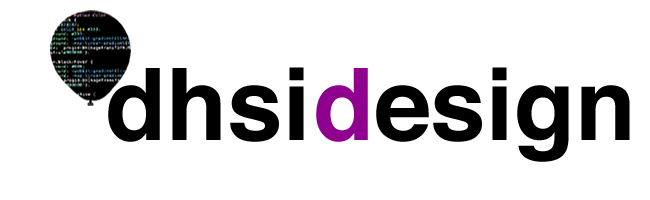
Emily and Verena discussed the importance of keeping the negative space of the logo header in sync with the rest of the background. They also coordinated the purple "d" in the header (#8E008E) with complementary colours.

These last-stage negotiations resulted in the consistency-variation and subtlety-boldness principles that undergird the published website.

The difficulty of describing visual stimuli and their impact naturally carries over in the narration of one's design choices. One thing we definitely learned in the collaborative space of DHSI is that to work on creating a website requires having a vocabulary to communicate what desired effect you want to achieve, and through what constitutive parts and processes.
So bear with me!
From the earliest stages of brainstorming, our group found itself employing the vocabulary of visual communication almost unconsciously as we talked through the principles we wanted the visual composition of DHSI Design to achieve. One of the first words used in conversation was "subtle", then followed by the idea that we have one piece of bold design or color. We were enacting in our design process the subtlety-boldness binary of strategic visual composition. Similarly, while discussing the affective impact of the website, Emily suggested that we work with lots of negative space to allow for easy legibility of the blog posts. Here, she was tweaking Alexander White's notion of space as one of "The Seven Design Components". After going off to design the various elements of colour scheme, logo, fonts, and layout, we met to discuss rendering these parts into an overall aesthetic. This was where visual composition had its last say.
Emily and Verena discussed the importance of keeping the negative space of the logo header in sync with the rest of the background. They also coordinated the purple "d" in the header (#8E008E) with complementary colours.

Similarly, they used a monochromatic color scheme to coordinate the blues of the CSS in the balloon with those of the dates, label tags and hyperlinks.
These last-stage negotiations resulted in the consistency-variation and subtlety-boldness principles that undergird the published website.
Design Demands Attention
My digital humanities eureka moment occurred at 5:20pm on Tuesday, June 5th, 2012 and its catalyst was as much brilliant design and multimedia as content. I was watching and listening to Jeffery Witt describe what seemed to me an interesting take on an online digital critical edition of an ancient work in philosophy by Petrus Plaoul when he clicked on a link, opened a hidden menu, and brought forth an image of the original manuscript text – actually one of four different editions – with two taps on a track pad I was hooked. Although I find them fascinating, text encoding and digital edition projects are not my field and I have struggled at times understanding the application.
At 5:20 Tuesday, I got it. I see the incredible scholarly merit of many DH projects that had escaped me. While Jeffrey Witt’s project is brilliant in conception, it is the design that sparked my DH awakening. Witt’s design meets all of Lev Manovich’s key features of new media design. The project is modular, with translation and original image easily connected and navigated. The edition is automated in the presentation of the image of the original manuscript. It is variable in the choice given to the user on which section, translation, or ancient edition is accessed. Finally, the ancient manuscript images are transcoded to make them more accessible and useful in the context of a digital critical edition.
The key design feature that seals the deal, however, is that of proximity. The Latin encodings, translations, and original manuscript images are viewed one above the other with one click. Even a non-Latin reading, non-medievalist such as myself can have fun with Petrus Plaoul. In fact I have found myself going back to the site - even before I decided to write this post. Placing the new and the old work in close proximity focuses and maintains my attention.
Great design has this effect, when Dr. Witt clicked on the link to the image of the original, there was an audible rumble in the audience as eyes lifted from Twitter feeds to focus their attention on a unique design where key elements of research are placed in proximity. In digital projects great design grabs you by the shoulders and holds you in place giving the content a chance to seep in.
Explore Jeffrey Witt’s critical edition www.jeffreycwitt.com
 |
| Click to Enlarge |
The key design feature that seals the deal, however, is that of proximity. The Latin encodings, translations, and original manuscript images are viewed one above the other with one click. Even a non-Latin reading, non-medievalist such as myself can have fun with Petrus Plaoul. In fact I have found myself going back to the site - even before I decided to write this post. Placing the new and the old work in close proximity focuses and maintains my attention.
Great design has this effect, when Dr. Witt clicked on the link to the image of the original, there was an audible rumble in the audience as eyes lifted from Twitter feeds to focus their attention on a unique design where key elements of research are placed in proximity. In digital projects great design grabs you by the shoulders and holds you in place giving the content a chance to seep in.
Explore Jeffrey Witt’s critical edition www.jeffreycwitt.com
Image standards
This is about the nuts and bolts – the technicalities of file types and attributes that will make your images viewable to your readers.
First of all – file formats.
GIF for graphic elements with large blocks of similar colours, for example logos.
JPG for photographs
PNG combines elements of both GIF and JPG
Here is a web site that summarizes the differences and gives some examples.
http://www.sitepoint.com/gif-png-jpg-which-one-to-use/
What if your file is not in the format you want? Most photo editors such as Photoshop can convert your file and save it in multiple formats. Check out this list of free online graphic converters: http://www.internetymultimedia.com/?q=node/58
A word about file size: As a general rule, provide the smallest file size that will meet the quality requirements of your user. For example, a photograph of a work of art that your may need to be examined in great detail will require a larger file size than a photograph that is provided as a general illustration on your site.
Adjusting the resolution (expressed as dots or pixels per inch, or dpi/ppi) can help to achieve this objective. You can do this in Photoshop using the Image Size dialogue box.
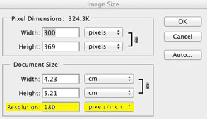
 Here is a portion of a photograph that is originally a 180 dpi JPG (175kb)
 This can be reduced to 72 dpi (124kb) without a huge loss of quality:
 But if this 72 dpi photo is cropped to show just a small detail, things can get fuzzy!
Remember – once the pixels are gone, they’re gone! Always save your original photos in their highest-quality format and resolution so that you have more pixels at your disposal for future close-ups.
First of all – file formats.
GIF for graphic elements with large blocks of similar colours, for example logos.
JPG for photographs
PNG combines elements of both GIF and JPG
Here is a web site that summarizes the differences and gives some examples.
http://www.sitepoint.com/gif-png-jpg-which-one-to-use/
What if your file is not in the format you want? Most photo editors such as Photoshop can convert your file and save it in multiple formats. Check out this list of free online graphic converters: http://www.internetymultimedia.com/?q=node/58
A word about file size: As a general rule, provide the smallest file size that will meet the quality requirements of your user. For example, a photograph of a work of art that your may need to be examined in great detail will require a larger file size than a photograph that is provided as a general illustration on your site.
Adjusting the resolution (expressed as dots or pixels per inch, or dpi/ppi) can help to achieve this objective. You can do this in Photoshop using the Image Size dialogue box.


Remember – once the pixels are gone, they’re gone! Always save your original photos in their highest-quality format and resolution so that you have more pixels at your disposal for future close-ups.
Principles of Design: Color
Why Color Is Where It's At
We chose to begin our design process by selecting a color scheme for our blog. Color is incredibly important because it will influence most (if not all) of the other decisions you will make about logo design, layout, and so forth. This is because colors can lead the eye to certain parts of the page, make elements advance or recede towards the background, or make elements appear larger or smaller. Consider the following:
- Lots of white or soft, light colors can give the illusion of space.

- Warm colors tend to stand out, whereas cool colors tend to stand back.

- Saturated (ragingly bright) colors catch the eye, so you should use one of them to emphasize a single point

Selecting a Mood
Color schemes also are important in creating an overall mood for your site. In considering mood, keep in mind the audience you are trying to reach and the product or message you are trying to promote. For color scheme ideas, look to the professionals: Nordstrom is an upscale outfit and so they use a simple, formal black and white color scheme. Anthropologie has a vintage clothing theme going, so they use washed out colors and playfully bright highlights to express a mixture of romantic nostalgia and fun. Don't feel like you have to come up with a completely original color scheme- go with what has already been shown to work!Here are some examples of webpages that really create a mood with color:
More Hazards More Heroes
 This is the webpage for a folk musical group based out of Nashville. They have selected a complementary color scheme of turquoise blue and orange. Notice how the interactive parts of the page (the "play" and "download" buttons) are graphically rendered in warm colors, whereas the static parts of the page, such as titles, are in cooler shades. The muted brown tones in the background echo the laid-back, simple acoustic music that the group plays.
Brunet Garcia

Decode
 Here is another design agency with a beautiful website. They have employed a triadic color scheme, using brown, fuchsia, and sea green. Notice how large blocks of color that are merely decorative (i.e. in the background) are understated, whereas the tiny hyperlinks are bright pink! These unlikely colors give the site a youthful, modern vibe, but are slightly muted so that they avoid recalling a 6 yr-old girl's bedroom. Chocolate is a great color because it can add a subtle tone of seriousness to its more outgoing neighbors. In this case, it is replacing orange as the third element in a triad.
You don't have to have a bunch of flashy graphics to make good use of color on your website. Basic shapes can be just as striking and often very appropriate. If you are interested in adding your own photographs to your design, check out our blog posts on photography- anyone can take artful, beautiful photos with a little practice, and it doesn't require thousands of dollars of equipment, either!
Principles of Design: Typography
Legibility and Readability
For the typeface designer, the concept of legibility - or ensuring that each individual character is distinguishable from the rest - remains a primary concern. However, for most web designers employing already-assembled fonts, the typographic principle of readability becomes more important, itself branching into two distinct concerns: the ability to see the text on the screen and the ability to read the text on the screen. Both concerns are front-and-center in the designer’s rationale behind choosing their font. Additionally, the designer has the option of manually kerning the characters and adjusting the leading between lines, allowing for the most effective contrast between white space and characters. In our Multimedia course, this was accomplished using Fireworks and CSS: for example, in her execution of the “DHSI Design” header logo, Emilie manually kerned Helvetica to allow the weight of the font its maximal visual impact. In the choice of font for the blog’s main content, Verena chose Open Sans with both seeing the text and reading the text in mind. Open Sans employs more space between characters, allowing the reader to visually digest the posts and also to read across at a quicker pace.
Combining Fonts
In most websites, the designer has to choose a combination of fonts to service the header, body, sidebars, and footer. While all of these spaces in the visual field don’t have to be different, often it helps to strategic choose how your fonts will work with, or against, each other. The three main options for this process are concord (high degree of similarity in adjacent fonts), contrast (high degree of difference), and conflict (neither, but not similar enough to be harmonious). The Typetester online tool is a great way of seeing how your various font choices will look alongside each other. Once we decided to operate within the sans-serif family of typefaces, our design template involved working within, and tweaking, the concord strategy. In the header, Helvetica achieves certain things on its own - for example, as a bold, big, bloggy, and yet minimalistic font, it coordinates with our image and color scheme, letting the color coordination stand out - however, it also works concordantly with Open Sans in the body.


Fonts for the Web
When selecting typeface for the web, you have to keep in mind that text will be displayed in a number of different contexts- mobile devices, different browsers, and different operating systems handle fonts in divergent ways. Increasingly, normalizing typeface is becoming automated, but there are still some good standard practices to follow for the web. One is to specify a font family rather than just one font for your blog. (Usually interfaces like Blogger and Wordpress do this for you). A font family is a collection of similar fonts in a list, usually found in your CSS. If the first font in the list can’t be displayed, the next one will automatically be displayed.
So, if you specify “Arial, Arial, Helvetica, sans-serif” as your font family, the browser will first display text in the Arial typeface. If no Arial fonts are available, it will move to Helvetica, and finally any sans-serif font if nothing else is available. This keeps your text looking relatively consistent across different devices. Here is a nice display of font families. Another great resource for fonts for the web is Google web fonts which hosts hundreds of free fonts on the web that you can link to with your CSS. This means you can use totally crazy, creative fonts and they will still work on other peoples’ displays.
We stuck with a simple, sans-serif collection of fonts for our website. In general, the textual content of a site like a blog is most easily read with a simple, appropriately sized font like Verdana or Arial. Elements of a site like headings, subheadings, and page titles can be more creatively typeset, as viewers will skim over them quickly and their primary purpose is to break up large chunks of homogeneous text.
Cultural Considerations of Typography for Web Design
The explosion of digital text has meant that fonts and word processing are now permanently interwoven with the texture of everyday aesthetics. This means that the use of fonts on the web throughout the Internet’s history has given certain typefaces cultural associations. It is important to watch what other designers are doing in order to catch aesthetic trends and adapt to them. For instance, you probably have recognized that Comic Sans is not popular with web designers- In fact, it’s anathema. Meanwhile, clean, minimalistic fonts like Helvetica have become a popular way to express forward-thinking design savvy. Some other considerations:
- Verdana is a very legible font, but it is also “invisible” because so many people use it. This makes it a great font for large blocks of textual content that must be read carefully.
- Times New Roman is also very legible, but because it was the default font in the “Netscape era,” it can make a page come across as out-of-date. It can make for nice headings, however.
- In general, serifed fonts can evoke more of a “period” look because they were used in pre-digital print for so long. This can be great if your webpage has a vintage or historical vibe, but probably isn’t appropriate for advertising cutting edge techie innovation.
For the total typography geek, I Love Typography has great font reviews that explain the historical background behind the creation of innovative and beloved fonts. They also have good articles on selecting fonts and typography for the web.
Subscribe to:
Posts (Atom)