Hey!
So you're wondering about movies and videos and worried you can't handle it!? No problem! With the help of iMovie you can create short videos, cut, edit, attach voiceovers or simply add a few of your favourite tunes to get that perfect ambiance. The key is to plan ahead and simply have fun :).
Check out the little piece I worked on to get a better idea of what iMovie can bring to your home, workplace, library (cave?).
Friday, June 11, 2010
Screenflow: "let me explain"
We all know that a picture is said to be worth a thousand words. In the tech world, we definitely know that a demo is worth a thousand pages of manual and help files. Screenflow is a screen capture tool that allows you, among other things, to create simple videos that demonstrate a process.
Rob Williams has created this Screenflow video, illustrating how to post a tweet through the Twitter web page:
Rob Williams has created this Screenflow video, illustrating how to post a tweet through the Twitter web page:
Kent takes over the Twitterverse

As Twitter was being covered in class by @digiwonk, Kent whined to his two twitter followers: I still don't see why I would try to find anything useful on twitter.
Jean: After tweeting to the DHSI crowd for a couple of days, and amassing a bunch of followers to our @DHSIdesign feed – how’s it feel? Is your Twitter-sense any less curmudgeonly?
Kent: I’m pumped, stoked, fer sure – what I lacked was purpose – I needed to have a reason to follow people working in my area of research who tweet. I’ve found those people and I’m following a critical mass of DH colleagues with ab fab ideas. This could become like crack cocaine – need to check twitter first thing in the morning and throughout the day…..a bit worrisome actually.
More and more metadata
Findability and searchability. Those were our goals for this blog--so, metadata to the rescue!

To tackle the matter of making the blog findable by a search engine, we've put metadata in the head of the blog's html template. Looks like this:

Notice how we're also using the Dublin Core standard to describe our blog? I didn't see other blogs doing this, but since there's an existing metadata standard to describe web documents, we're using it. Now if anyone uses a tool that harvests DC metadata from web documents, DHSIdesign is covered.
To make the content of our blog more searchable, we're using a controlled vocabulary to tag, or label, our posts. This way, related posts will be collocated within the blog.

Ironically, "metadata" isn't included in here. :) So we're officially adding "metadata" to this list, starting . . . now.
Blogger is already telling us who created posts and when they were posted, so we didn't need to include that information.
Now, hopefully, people will be able to 1) find our blog and see what it's about and 2) navigate the content within. Yay!
Podcast: The Benefits of Mobile Learning
 Here's a small audio file advertising the benefits of podcasting and social networking for today's classrooms. For anybody involved in distance- and language learning, just to give two examples, digital tools are priceless.
As somebody involved in Slavic Studies, I can vouch for the fact that my own field has much to gain here. Russia has the world’s most engaged social-networking audience. Russians use networking sites at a rate far above the world average, spending close to 7 hours per month on them (rather than the international average of 3.7 hours), and viewing over 1,300 members’ pages over the same period, rather than the usual 525. This is where language matters to our students and their studies, long after the school day has ended.
Following the successful use of SMS, mobile email, mobile discussion boards, and handheld messengers in SLA tasks, we can see that convenience has a direct and positive influence on student participation and gain. To care more, consequently, means to achieve more – in patterns of intersubjective meaning.
Discover Simple, Private Sharing at Drop.io
Blog design
Blogger is great for the flexibility it gives users in customizing themes and layout. After you set the default colors and fonts of your blog, you may still find that there are other properties you'd like to customize. In the interests of allowing other would-be bloggers to learn from our work, I will document the CSS properties I added to the template using the HTML editor function on Blogger.
Here are the styles I added to the template in order to set the background image and anchor it to the top:
body {
background-image:url('http://farm2.static.flickr.com/1303/4689693936_a31a9da55d_o.jpg');
background-repeat:x-repeat;
background-attachment:fixed;
}
#outer-wrapper {
background:$bgcolor;
}
These CSS styles I added to the Flickr badge:
#flickr_badge_uber_wrapper {
text-align:center;
width:175px;
}
#flickr_badge_wrapper {
padding:10px 0 10px 0;
}
.flickr_badge_image {
margin:0 5px 0 5px;
}
.flickr_badge_image img {
border: 1px solid black !important;
margin: 5px 4px 0px 0;
display:inline;
float:left;
}
#flickr_badge_source {
text-align:left;
margin:5px 10px 0 10px;
}
#flickr_badge_icon {
float:left;
margin:5px 5px 0 0;
}
Four techniques for better photos
Angle, Closeness, Rule of Thirds & Light
This week we studied four basic techniques to improve our photography.
Angle
Angle can increase the drama or excitement level in a photograph. Below is flat, right-angle bench:
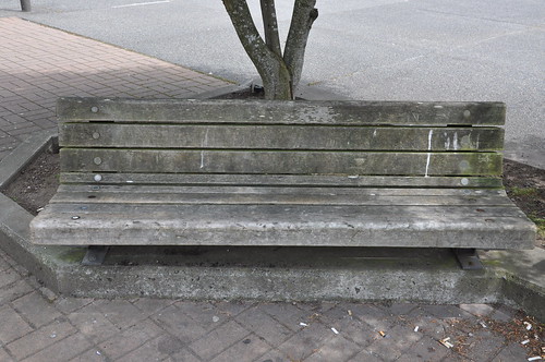
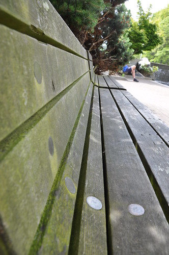
The angle influences the visual reception of a "subject" by the audience by manipulating the points of emphasis.
Closeness
Use closeness to compose a better photo. This first clock is too far away:

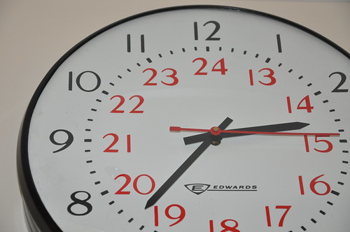
The distance from the "subject" in the first picture makes it hard to focus on the clock, while the second one draws the attention towards the theme of "time" and helps the audience to focus on the intended content of the photograph.
Rule of Thirds
The rule of thirds encourages us to compose the subject of our photograph at intersections. In the first photo, our intended subject (the rock) is squarely in the center of our photo, causing us to lose focus on the subject, diverting our attention to other parts of the frame.
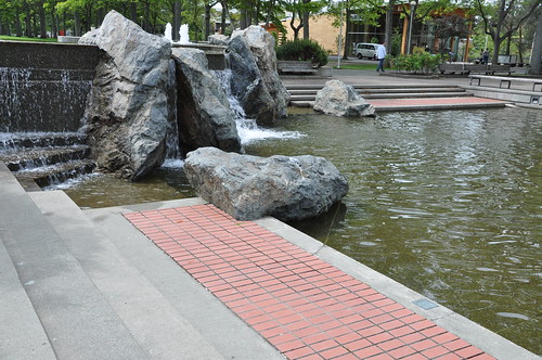

In the second image, the rock is made more interesting by placing the horizon line at 'rule of three' intersections.
Light
Another key to make your photograph better is to make the maximum use of the light. Natural light is almost always better than artificial light. Cloudy days often provide the best light. The first photo is taken indoors under fluorescent lighting.
The second photo is taken outside on a cloudy day.
If you'd like to see more of our photos, have a look at the DHSIdesign Flickr pool.
This week we studied four basic techniques to improve our photography.
Angle
Angle can increase the drama or excitement level in a photograph. Below is flat, right-angle bench:
The angle influences the visual reception of a "subject" by the audience by manipulating the points of emphasis.
Closeness
Use closeness to compose a better photo. This first clock is too far away:
The distance from the "subject" in the first picture makes it hard to focus on the clock, while the second one draws the attention towards the theme of "time" and helps the audience to focus on the intended content of the photograph.
Rule of Thirds
The rule of thirds encourages us to compose the subject of our photograph at intersections. In the first photo, our intended subject (the rock) is squarely in the center of our photo, causing us to lose focus on the subject, diverting our attention to other parts of the frame.
In the second image, the rock is made more interesting by placing the horizon line at 'rule of three' intersections.
Light
Another key to make your photograph better is to make the maximum use of the light. Natural light is almost always better than artificial light. Cloudy days often provide the best light. The first photo is taken indoors under fluorescent lighting.
The second photo is taken outside on a cloudy day.
If you'd like to see more of our photos, have a look at the DHSIdesign Flickr pool.
Logos and what they convey 2

http://www.aupress.ca
An Open Access Scholarly Press: a digital collection of peer reviewed scholarly work that provides valuable educational resources (e-books, journals, websites and videos).Great compact logo! It ties in a generic bird silhouette with a short block of capital letters (AU PRESS). Mirror effects provide repetition for cognitive emphasis. Did you notice the AU with Athabaska University cosying up below? What about the silver shading and brush strokes that connote airyness and elevation echoing the bird taking flight graphic? For me, this logo conveys a UP press that’s forward looking and flexible!
LOGOS and what they convey
Typefaces evoke particular moods. Also consider, for the overall design, issues with legibility and visual impact of graphics, fonts, colour, composition and even special effects.
Some examples from RESEARCH PROJECTS

This logo conveys a feeling of confidence created by a typeface of gorged happy letters suspended over a celestial silver-blue, blown up pixel background. Beckoning, rich and boyant!
Some examples from RESEARCH PROJECTS

TAPoR
- Keeps track of texts users want to study.
- Helps users learn about different tools for text analysis.
- Allows users to run tools on texts to analyze them in different ways.
This logo conveys a feeling of confidence created by a typeface of gorged happy letters suspended over a celestial silver-blue, blown up pixel background. Beckoning, rich and boyant!
Thursday, June 10, 2010
It's not what you say, it's what you repeat
The internet is a big and complicated place, right? I don't know about you, but I probably look at 10 or 20 websites every hour. And follow a hundred or so Twitter streams, and subscribe to a heap of podcasts, etc. In fact, many of these streams and sites and 'casts are produced by the same people.
How to keep it all straight?
The streams and sites and media that are most memorable to me are those that have consistent visual elements across all their various permutations. We're trying to do that with DHSIdesign as well. You can see our blog logo at the top of this page, and we've created a Twitter avatar to match:
We're using this same graphic for our Flickr feed as well, so hopefully, every time you come across our work, you'll know immediately that it's us!
What do you think?
Subscribe to:
Posts (Atom)